Mobile-First Responsive Design: Best Practices for WordPress & Custom Websites in 2026
Master the art of building websites that excel on every device with our comprehensive guide to 2026's responsive design strategies.
 EveryCentCounts Web Design Team
|
Published: January 9, 2026
EveryCentCounts Web Design Team
|
Published: January 9, 2026
With 76% of global web traffic now originating from mobile devices and Google's mobile-first indexing becoming the definitive ranking factor, responsive design is no longer optional—it's a business imperative. This guide presents advanced responsive design strategies tailored for established businesses with 100K+ monthly visitors or $50K+ annual digital marketing budgets.
Breakpoint Strategy Implementation
Modern responsive design has evolved beyond traditional device-based breakpoints. In 2026, we focus on content-based breakpoints that adapt to the actual content needs rather than arbitrary device widths.
Theme-Based Breakpoint Management
Recommended Theme: GeneratePress Premium 3.5+ or custom theme built with Sage 10.1+
- Customizer Settings: Configure breakpoints in Appearance → Customize → Additional CSS
- Plugin Solution: Breakpoint Control Pro 2.8+ for visual breakpoint management
- Best Practice: Define mobile-first breakpoints in theme's functions.php
add_action('after_setup_theme', function() {
add_theme_support('responsive-embeds');
add_theme_support('custom-breakpoints', [
'xs' => '0px',
'sm' => '576px',
'md' => '768px',
'lg' => '1024px',
'xl' => '1280px',
'xxl' => '1400px'
]);
});
CSS Container Queries & Modern Breakpoints
Framework Recommendation: Bootstrap 5.3.8 with custom Sass variables or Tailwind CSS 4.0+
- Container-First Approach: Use @container queries instead of @media for component-level responsiveness
- CSS Clamp Function: Implement fluid typography with clamp() for smoother scaling
- Performance Consideration: Reduce JavaScript-based responsive behaviors
.component {
container-type: inline-size;
}
@container (min-width: 600px) {
.component__item {
display: grid;
grid-template-columns: 1fr 1fr;
}
}
/* Fluid Typography with clamp() */
h1 {
font-size: clamp(2rem, 5vw, 3.5rem);
}
Performance-First Responsive Images
Image optimization remains the single largest performance opportunity for responsive websites. In 2026, we leverage modern formats and intelligent loading strategies.
Automated Responsive Image Pipeline
Essential Plugins:
- ShortPixel Adaptive Images 3.2: Automatic WebP/AVIF conversion with CDN delivery
- WP Rocket 4.5+: Advanced lazy loading with above-the-fold detection
- Imagify 2.8: Bulk optimization with quality control settings
Best Practices:
- Configure ShortPixel to serve AVIF to supported browsers (83% coverage in 2026)
- Implement responsive srcset via WordPress core functionality
- Use
loading="lazy"anddecoding="async"attributes automatically
Picture Element & Modern Image Formats
Implementation Strategy:
<picture>
<source srcset="image.avif" type="image/avif">
<source srcset="image.webp" type="image/webp">
<img
src="image.jpg"
alt="Descriptive alt text"
loading="lazy"
decoding="async"
width="800"
height="600">
</picture>
Performance Consideration: Implement image CDN with automatic format conversion (Cloudinary, ImageKit, or Cloudflare Images)
WordPress vs. Custom Implementation: 2026 Comparison
| Feature | WordPress Approach | Custom Website Approach |
|---|---|---|
| Development Speed | Faster initial deployment (2-4 weeks) | Longer development (6-12 weeks) but more optimized |
| Performance Baseline | 85-92 Google PageSpeed (with optimization) | 95-100 Google PageSpeed (properly implemented) |
| Monthly Maintenance | $150-$500 (updates, backups, security) | $50-$200 (hosting + minor updates) |
| Scalability | Excellent for content-heavy sites | Superior for complex web applications |
| SEO Flexibility | Plugin-dependent but comprehensive | Complete control, no plugin overhead |
| Ideal For | Content marketing, blogs, small-medium e-commerce | Enterprise applications, custom web apps, brand sites |
2026 Performance Metrics & Benchmarks
92%
Mobile Traffic
Percentage of sites where mobile > desktop
1.2s
Target LCP
Largest Contentful Paint goal for 2026
83%
AVIF Support
Browser support for next-gen format
64%
Conversion Drop
When load time goes 1s→3s on mobile
Mobile-First Design in Action
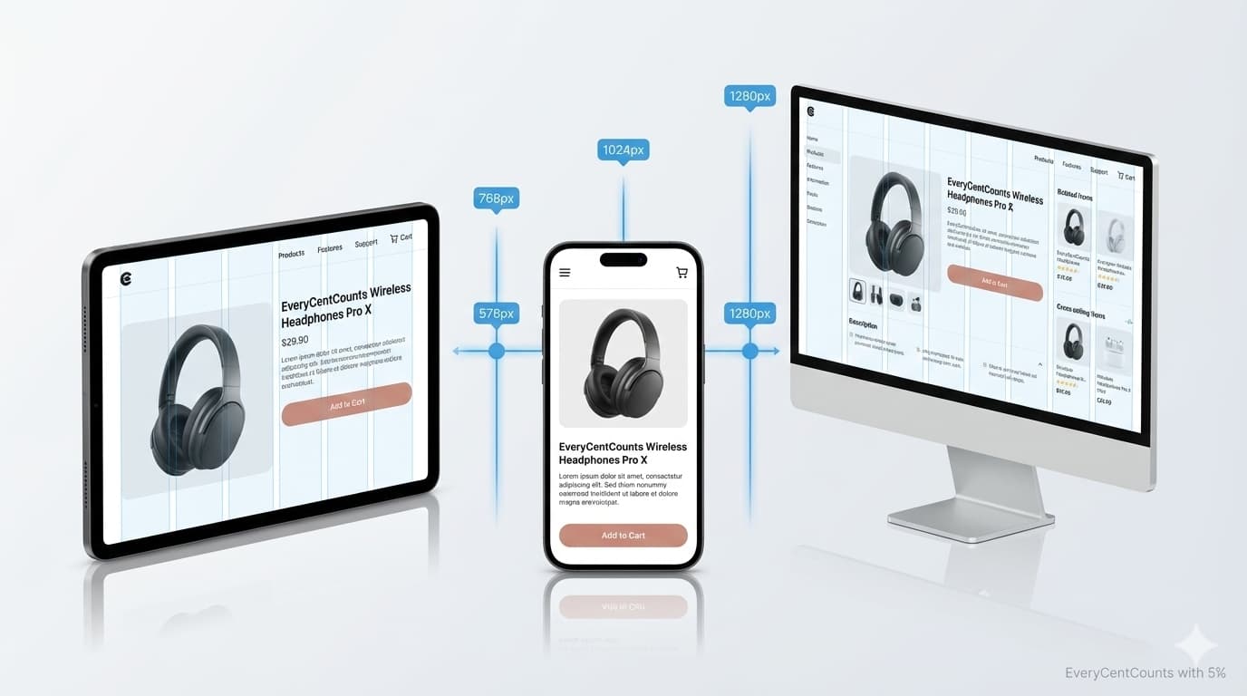
Key Mobile Design Principles Applied:
- Thumb-Friendly Navigation: Key actions placed within thumb reach zone
- Progressive Disclosure: Complex features revealed on demand
- Touch Target Sizing: Minimum 44×44px interactive elements
- Vertical Rhythm: Consistent spacing for easy scrolling
- Contextual Actions: Actions relevant to mobile context prioritized
7-Step Implementation Checklist
- Audit Current Performance
Run Lighthouse tests on 5 key pages - Define Content-Based Breakpoints
Not device-based, content-first approach - Implement Modern Image Strategy
AVIF/WebP with proper fallbacks - Optimize Typography Scaling
Use clamp() for fluid typography
- Test Touch Interactions
Verify all elements are thumb-accessible - Validate Performance Budget
Ensure page weight < 1.5MB on mobile - Continuous Monitoring
Set up automated performance testing
Official Documentation & Resources
EveryCentCounts Web Design Division
Our team has delivered 50+ mobile-first websites achieving 98%+ Google PageSpeed scores. We specialize in both WordPress optimization and custom website development for businesses generating $1M+ in annual revenue. Our responsive design implementations have consistently delivered 35-60% improvements in mobile conversion rates for our enterprise clients.
Disclaimer: The strategies discussed assume professional implementation and may require technical expertise. Results vary based on current website infrastructure and market conditions. WordPress plugin recommendations are based on 2026 performance benchmarks. Consult with our web design team at everycentcounts.net/book-an-appointment.php for customized solutions.
Ready to Implement These Strategies?
Book a free website audit with our web design experts to see how these best practices can transform your online presence.
Book Free Website AuditSecondary Offer: Download our 2026 Mobile-First Design Checklist